
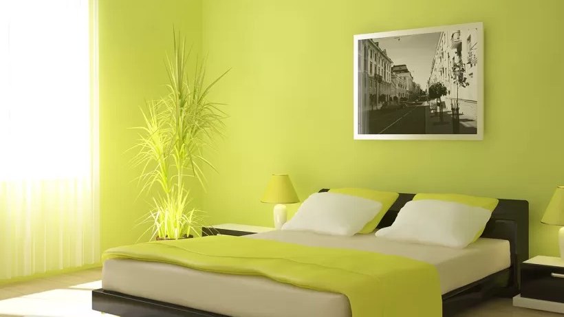
Repainting a bedroom costs a fraction of what a new bed, wardrobe or set of curtains would, and it changes the room more than any of them. The key is choosing the right bedroom wall colour combination, because two shades that share an undertone make walls look layered, while mismatched ones make them look patchy.
Add a suitable finish and tidy prep work, and even a standard builder-finish room starts to look designed. This blog covers six pairings that look luxurious yet stay light on the wallet, with placement and finish tips for each.
Warm Greige and Soft White
Greige, a mix of grey and beige, is the safest route to a polished bedroom. Paint all four walls in a warm greige and use soft white on the ceiling and trim. The result looks tailored, hides everyday marks and works with wood, metal and fabric in almost any tone. It is also forgiving in rooms that receive little natural light.
These points help the pairing look refined:
- Choose a greige with a warm undertone so the room feels inviting.
- Use a matt or soft sheen finish on the walls.
- Keep the white slightly lighter than the walls, never stark.
- Add a darker greige on the wardrobe or door for subtle contrast.
Deep Navy and Pale Grey
Navy on the wall behind the bed adds depth and a hotel-like finish. Pale grey on the remaining walls stops the room from feeling heavy. This pairing works best in bedrooms with good daylight, where the navy looks rich instead of dull. Because dark shades absorb light, add warm bulbs or pale bedding to keep the space welcoming.
Follow these guidelines for a smooth result:
- Paint navy on the headboard wall only.
- Pick a grey with a hint of blue so both shades connect.
- Use white trim to sharpen the edges.
Sage Green and Cream
Sage green feels calming without looking flat. Cream on the remaining walls keeps the room bright and warm, which helps smaller bedrooms. They create a soft, natural backdrop that suits both modern and traditional furniture. Both shades are forgiving, so minor wall imperfections stay less noticeable. Lighter sage shades make a compact room feel more open, while deeper ones add warmth to larger spaces.
Here is how to apply it well:
- Use sage on the wall that receives the most light.
- Choose a cream with a yellow base rather than a pink one.
- Pair the walls with cane or natural wood furniture.
- Keep the ceiling in the same cream for a seamless look.
Charcoal and Warm White with Panels
Texture adds value without adding much cost. Fitting PVC wall panelling designs with fluted or vertical grooves on the headboard wall, then painting them charcoal, gives a custom-made look. Warm white on the other walls stops the room from feeling dark. Panels also protect the wall from scuffs near the bed, and vertical grooves draw the eye upwards, which makes the ceiling look higher.
These tips protect the finish:
- Prime the panels first for even coverage.
- Use a low sheen paint so the grooves catch light softly.
- Limit the panelling to one wall to control the budget.
- Check that the primer is suitable for plastic surfaces.
Terracotta and Off-White
Terracotta brings earthy warmth that suits Indian homes particularly well. Use it on one wall and off-white on the rest. The pairing looks rich in evening light and hides minor wall flaws. Its muted, clay-like tone feels grounded, so the room gives a sense of relaxation. It also pairs well with the warm lighting most bedrooms use at night.
A few simple choices make it work:
- Choose a muted terracotta, not a bright orange.
- Add a beige or tan rug to ground the colours.
- Use brass lamps and frames to lift the warmth further.
- Keep curtains in cream or linen to avoid clutter.
- Test the shade on the wall at night before finalising.
Dusty Pink and Taupe
Dusty pink looks refined when it avoids sweetness. Choose a pink with a grey base, so it reads almost neutral, then pair it with taupe on the adjoining walls. The result suits adult bedrooms and guest rooms. Taupe adds structure, so the pink never turns too soft or childish. Metallic accents in gold or bronze finish the look.
Keep these details in mind:
- Avoid pinks with a strong red or orange base.
- Use taupe on the walls that face the window.
- Choose white or ivory for the ceiling.
- Pick a satin finish on the pink wall for a soft glow.
Conclusion
Also read: Top 4 Luxury Furniture Stores in Pakistan and Dubai
A tin of paint is the cheapest renovation tool in the house, and this list proves it. Each pairing here relies on shades that share an undertone, a sensible finish and careful prep, never on costly extras. Choose the mood you want to wake up in, test two or three shades on the wall itself, and commit to a maximum of three colours. Do that, and a standard bedroom starts to look designed without having to spend too much.
